Putting riders first at every stop
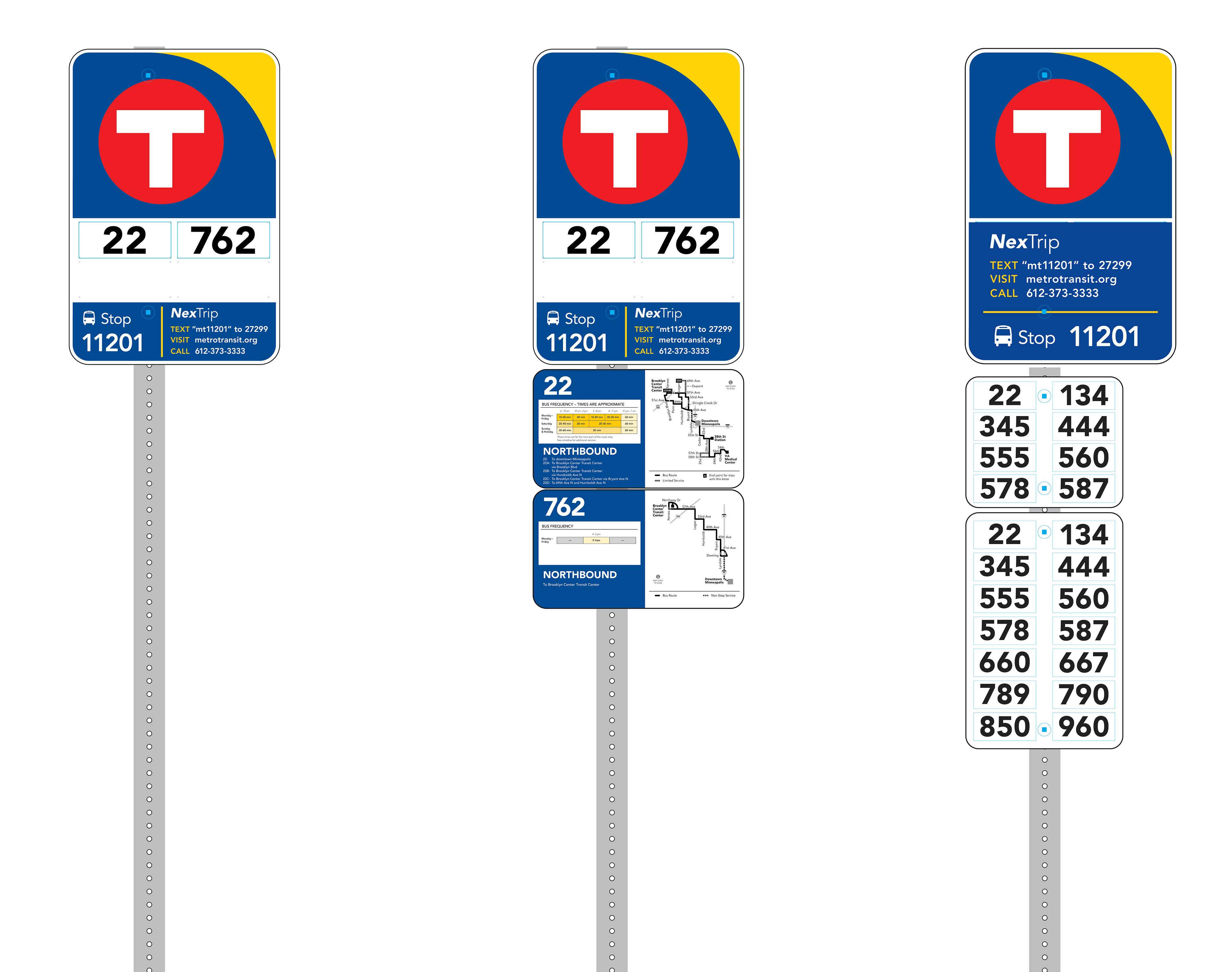
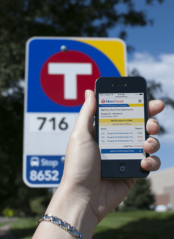
What started as a simple brand refresh for Metro Transit’s bus stop signs evolved into a two-year effort to improve the rider experience at more than 12,000 stops. I led design, research, and testing efforts, working closely with staff, riders, and vendors to create signage that’s clearer to read, easier to update, and more accessible for all users.
Design strategy and systems thinking focused on:
Identifying the most critical information for riders at the stop
Boosting rider confidence and ease of use through clear signage
Meeting accessibility standards (font size, contrast, mounting height)
Building a maintainable system for file creation, inventory tracking, and ongoing accuracy
Balancing cost-efficiency with long-term usability
Signage updates included:
Route numbers for all buses serving each stop
Unique bus stop ID numbers for accessing NexTrip real-time info
Clear branding and contact details
For busier stops: simplified route maps and frequency charts
For complex stops: expanded panels and larger decals to accommodate more information
Shelter posters were redesigned to feature:
Improved hierarchy and legibility
Visual route maps and fare details
Multiple options for accessing real-time schedule updates